
The previous post describes a period during my mid-20s to late-30s, of self-discovery and transformation , and how these ‘reprogramming’ experiences shifted some of my creative work into more esoteric or transpersonal art and design.
My first few years in Melbourne brought me into contact with a number of people involved in the ‘new age’ and ‘human potential’ zeitgeist of the time. Inevitably there were ‘psychic predators’, charlatans and utter space cadets among them, but overall I met many remarkable individuals and made some deep, enduring friendships. Most of these people were highly-skilled practitioners in so-called ‘alternative’ therapies; I discovered the power of emotional release through bodywork, as I explored reiki, shiatsu, kinesiology, neurolinguistic programming, rebirthing, deep tissue massage and many other modalities for self-transformation via the bodymind.

This diverse network of people shared a common language and motivation towards emotional honesty and creative growth in life. In various ways they were committed to developing a meaningful sense of self and a more humane society, and I felt welcomed in their company. I was appreciated and accepted for my personhood, not just my creative abilities; in response, my sense of self expanded and flourished in new ways, and in turn so did my creativity. I have generally felt more comfortable in the company of misfits, outliers and fringedwellers; looking back through my Aspergers filter, I can see how significant it was to my ‘autistic’ development (or expression?), ie being accepted for & feeling the freedom to be my most natural, authentic self. I was connecting with a diverse range of people who felt they were somehow ‘other’, a step to the left of the tribal consensus, who were often deep thinkers & feelers, and I felt both at home and inspired to be ‘more’ of myself.
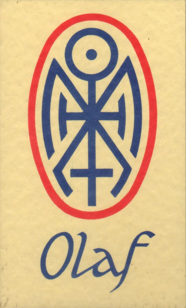
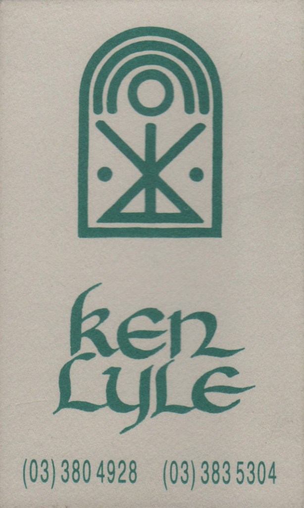
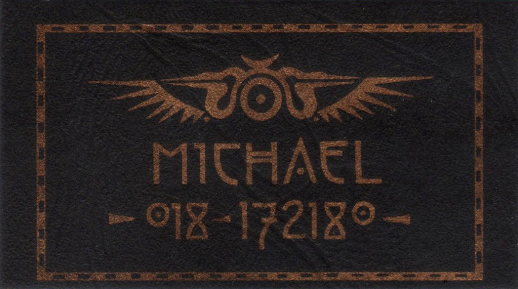
I had been immersing myself in the work of Carl Jung and Joseph Campbell, and was especially interested in the use of ‘sacred’ symbols throughout history; how humans had developed symbol (in ritual, ceremony, magick, advertising, propaganda etc) as a sophisticated tool for focusing ‘power’, a consciousness-programming device. In 1990/91, I was exploring symbolic representations of people via portraiture, and had designed a few personalised symbols for friends, as elements within their Essence Portraits. I also designed one for myself, each element of it attributed with meaning, or qualities I wanted to affirm in myself. I used it as my ‘mark’, a logo and signature, and it was my first tattoo. In these early designs I came to realise the creative appeal, the design puzzle, of distilling characteristics (of a person / place / state of experience) into a few simple abstract shapes & lines, a kind of Zen code. I moved my creative focus away from drawing portraits, to designing graphic symbols, whose process & outcome were, by their nature, more compact.
As I developed confidence in my intuitive receptivity, I began to advertise personalised symbols as a kind of creative ‘reading’. I never felt comfortable calling myself psychic or clairvoyant, but I gradually refined a process in which I felt I could ‘tune in’ to another person at a subtle level, and translate my impressions into a symbolic design. For want of a better term, I called these designs Personal Power Symbols, which seemed to fit the popular language of the time. There were other artists offering ‘spiritual’ art such as drawings of auras, past lives and ‘spirit guides’, and a swathe of people making use of traditional sacred symbols from all points in history, but it is in my (autistic?) nature to innovate or shape the familiar into something that feels original or contemporary, and I think that gave my approach a different edge.

Many of my first PPS clients were therapists & ‘healers’ of one kind or another, and we often exchanged our skills in lieu of money. ‘Doing business’ this way made the interaction more personal, gave me access to some high quality therapies when I was needing it, and elevated my own valuing of my work (something many artists and autists find difficult to do). Sharing the process in this way was deeply satisfying, as both parties were bringing their best skills to the exchange. Thanks to these formative experiences, and in fact at the insistence of several clients, I began to charge (gasp) money for the symbol designs. Keep in mind, I didn’t lack confidence in my technical ability – I had been immersed in drawing, illustrating and designing for a couple of decades – but I was testing new ground for myself, and the nature of what I was offering here had a very different responsibility attached to it than, say, creating an editorial cartoon illustration or designing a business logo.


Essentially what I offered was a creative experience that encouraged people to reflect a little on their inner workings, and the outcome (in this case, the symbol) was encoding that experience into a visual object, which could then be focused on for further reflection – not altogether different from the use of mandalas in Jungian psychology, a rune or talisman. When a client came to me, I took care to create an environment in which the person could feel as relaxed & at ease as possible. I tried to dispel any reservations they might have about the process being mysteriously ‘new age’ or psychologically intrusive, preferring to frame it as a collaborative creative process. Each session began with a drawing ‘game’ I’d learned from a friend, in which the person was given drawing materials & a sheet of abstract symbols, and asked to spend as much time as they liked adding any lines, colours, patterns and words to the symbols that they felt an urge to – visual free association. Often I played ambient, meditative music – I find that music with lots of open space seems to promote a distortion in timesense, a timelessness that can free up creative flow. While my ‘client’ drew, I set my own mind to an open receptive state, and made notes of any impressions that presented themselves – words or phrases, particular shapes or lines, imagery, sometimes even a specific symbol – and recorded everything no matter how seemingly incongruous. By actively intending an open state of mind in this way, allowing rather than trying to direct, I seemed to access remarkably accurate details about the person which I would otherwise have no way of knowing.
Some people felt so creatively energised in their drawing that they spent hours covering the page with an explosion of expression, others were more succinct: one person simply added a discreet & carefully-placed dot to each symbol. Another person added only writing in the form of stream-of-conscious poetry. I was always amazed at the diversity, and everything about their responses told me something about their personality. Once they were done, we would look at their page together and discuss any impressions we had, and I would share the notes I’d made while they’d been drawing. Through this collaborative process, the key elements of their symbol design would emerge as a rough draft, which I tweaked into shape if necessary until they were happy with it. Then they were free to go, and the next stage was for me to render the symbol in crisp black ink, hand-drawn and mounted on card. This was accompanied by a carefully hand-written ‘reading’ of the symbol, describing in detail its various elements and what they represented in the person’s nature, their innate strengths and positive qualities. I wanted the whole package to reflect both a professional & intimate aesthetic, something special.

Many people used their personal symbol as a logo for their business, and many are still wearing them as tattoos. In the 90s there was renewed interest in all things tribal, including indigenous tattoo traditions, so my symbols were popular in that they often had the appearance of something ancient while having unique personal meaning. It was a fascinating way to meet people, to be intentionally interested in them (isn’t that what psychologists do?), and many far-reaching philosophical conversations were had. The Power Symbols remained one of the more consistent strands of my freelance work between 1992 – 97, and one client was so pleased with the designs I made for her brother & herself that she supplied me with at least a dozen more clients over those years. The work seemed to peak through ’94 – ’95, and probably tapered as I gave more focus to other creative work.
Over the years, I began to notice certain interesting patterns emerge in the work. I don’t take ‘past lives’ literally, I think of it more as a creative lens for the psyche to explore itself from another perspective, but often in the ‘reading’ process I would get very vivid imagery of the client in some other point in history – the details were often peculiarly specific and pertinent to the client (sometimes more than they wanted to admit!). I always encouraged the client to think of it as a creative metaphor, but I noticed that this mythological imagery only seemed to occur for clients in their 20s and 30s. And just as consistently, the impressions I ‘received’ from clients in the 40+ age range were more nature-based, elemental – often ‘seeing’ the person as a particular landscape, in which key parts of the landscape symbolised different aspects of their character. I had observed something similar when I drew Essence Portraits – that a person’s ‘elemental’ energy was often quite specific: for instance, one ‘fiery’ person might express fire as shooting sparks, another as smouldering coals, another as leaping flames. One ‘watery’ person might express their water as a deep, still pool, another as waves crashing on the rocks, another as a sparkling, chattering brook. When I noticed this pattern in my older (40+) clients, I generalised that perhaps from middle-age on we become more connected to our Nature. I also generalised that the ‘past life’, or ‘mythological’, impressions might imply that in our 20s – 30s we are still shaping ourselves (our ‘story’) according to Identity rather than Nature or Being.

There were a few interesting anomalies in this work. The youngest client I had was a 21-yr old man, and while he was happy with his design, I resolved not to take clients that young again – there was too much of an unlived discrepancy between his still-forming image of himself and what I felt I was seeing of his future self (and of course, who am I to say?). One young woman came to me in the midst of a deep inner transition, shedding an old identity and adopting a completely new sense of self (including changing her name); I experienced her distinctly as two very different entitites, and consequently I felt compelled to give her two very different symbols, one more geometric and delicate (her ‘old’ self), the other (her ‘new’ self) more primitive and raw. While she immediately resonated with the latter, when it comes to our various ‘selves’ I tend to think more towards integration of identities than denial of some over others – but of course, it was her process.
Another pattern I noticed was how, for clients who seemed to have either a clear sense of self, or at least were comfortable in their own skin, the symbols seemed to offer themselves up easily; for clients who were less sure of themselves, were more guarded in the process, or had confused motivations for wanting a symbol, the process took more effort. In these cases I doubted myself, until I realised it was just as likely I was sensing their own doubt.
I will never forget my most difficult client, and in many ways the richest challenge. Linda, one of my earliest clients (and who pointed about a dozen of her friends in my direction over the ensuing years), wanted to commission a Power Symbol for her boyfriend BUT she wanted it to be a complete surprise – that is, she wanted to book him in for ‘the process’ without him having any knowledge of what it was for. He wasn’t to know until presented with the finished symbol. I didn’t really think it was fair on him, and it messed with some of the collaborative aspects of my process, but I said I’d give it a shot.
He turned up at my studio, a biggish bloke but not a brute, wearing black wraparound sunglasses that he refused to take off for the duration of the session. He was clearly defensive (understandably) and not about to give an inch. I was frank with him about how I found it difficult to connect with him while he was wearing sunglasses, but he was resolute. He didn’t want to engage with the drawing exercise. When I plied him with questions, his answers were guarded. I explained I was in an unusual position because of the parameters Linda had set. In the end, I decided to just focus on noting down my impressions of him while he sat there. What I ‘saw’ was some of the most graphically violent imagery I’ve had with a client. I saw him as a high-ranking Aztec priest, whose ordained function & specialty was human sacrifice. There was blood and guts everywhere. At the same time, I had a sense of this high priest having to maintain a very specific relationship with mortality, not cold, but a detachment that included profound respect for the danger & power of life. Within this same story, the priest had a remarkable intellect for engineering, and was responsible for the design and construction of a complex network of stone aquaduct systems that channeled water throughout his city. I interpreted this as symbolic of the carefully-ordered systems this man used to control and channel his emotional currents. Usually in a session I would discuss my impressions with the person and see how they responded, out of genuine curiosity but also to check if there was any correlation for them – but Linda had asked me not to reveal anything, so I just had to trust my instincts. I designed the symbol without his feedback, and wrote up the ‘reading’, detailing everything I’d ‘seen’. I delivered it to Linda and explained what had happened. Later he called me to say how much he liked the design, and told me that he was trained in electrical engineering, but was currently working in a pathology lab, dealing with blood samples. Firstly, I was relieved that he actually liked the symbol, and secondly, that my impressions appeared to be accurate, or at least synchronistic.

Looking back now via an autistic understanding of myself, I can see how these symbol designs were just one expression of a deeper drive in me, that is, my desire to get to the ‘essence’ of a thing – whether an idea, an emotion, a process or an experience – to uncover its most fundamental elements, its core.
I think it was this same drive (toward ‘truth’?) that led me to eventually stop designing Power Symbols for people, even though I was still attracting business. I had spent so many years studying symbology, embodying symbolism in so much of my life, but came to a halt when I realised how utterly devoid of meaning every symbol is, that a symbol can only ever reflect whatever we impose upon it. I felt a deeper sense of responsibility then; I couldn’t justify telling people their symbol was steeped in meaning while knowing the symbol was meaningless. It felt like a lie – and many autistic people will tell you, truthfulness and integrity are something we feel strongly about. Abruptly, the work just had to end.
In retrospect, it was an amazing journey, with many colourful adventures and lessons along the way. I immersed myself for a time, with typical autistic intensity, in the world of symbols and by extension the vast universe of the collective unconscious. In my own paradoxical manner, I saturated my consciousness with ‘meaning’ in order to arrive at none.